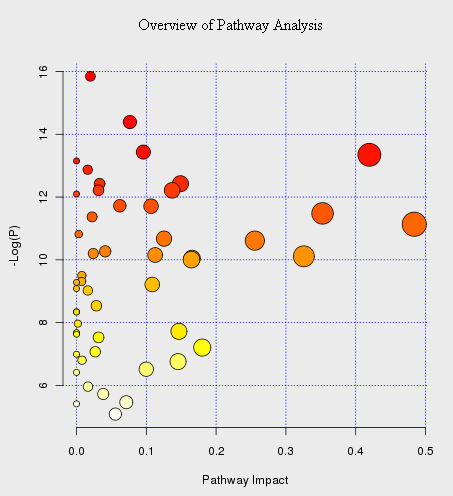
An example of “metabolome view” is shown below. It contains all the matched pathways (the metabolome) arranged by p values (from pathway enrichment analysis) on Y-axis, and pathway impact values (from pathway topology analysis) on X-axis.
The node color is based on its p value and the node radius is determined based on their pathway impact values. The pathway name is shown as mouse-over tooltip. Click the corresponding node when the tool-tip shows will launch the corresponding pathway view