The pathway heatmap is an appealing visualization to clearly shows how the expression of each pathway gene compares to the others. It is generated when you click a pathway or gene set name in the “Gene Set Enrichment” panel at the result page. An example output is shown below
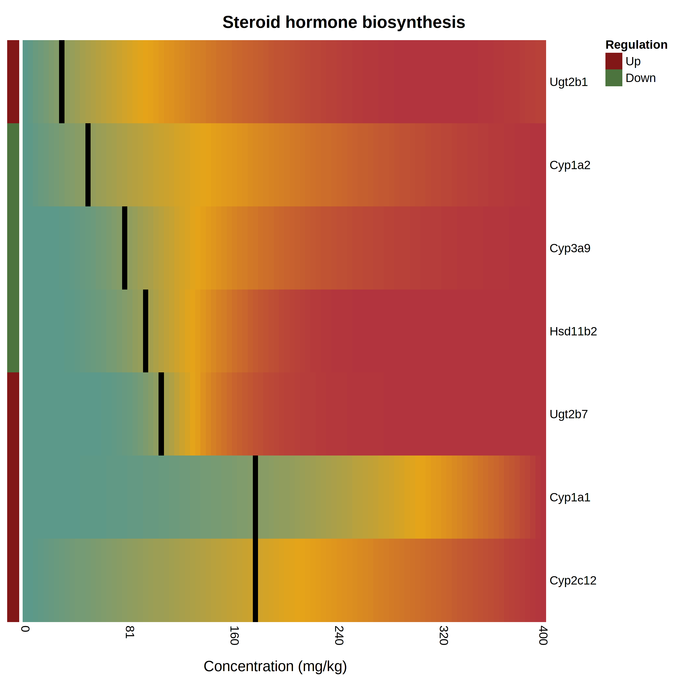
The pathway heatmap values are calculated through a series of steps:
- The fitted model for each gene is evaluated across the range of doses in the uploaded data.
- The resulting modeled expression values are normalized by subtracting the minimum and then dividing by the maximum, producing a set of numbers [0, 1].
- Genes with a BMD that is down-regulated compared to the control are identified. Their values are inverted by subtracting 1 and then multiplying by -1, which creates a consistent colour gradient from blue on the left to red on the right. The direction of regulation is noted by the coloured boxes on the left side with red for up-regulated and green for down-regulated.
- Genes are ordered by their BMD.
- The heatmap cells where geneBMDs fall are coloured black.