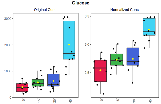
In a boxplot, the bottom and top of the box are always the 25th and 75th percentile (the lower and upper quartiles, or Q1 and Q3, respectively), and the band near the middle of the box is always the 50th percentile (the median or Q2). The upper whisker is located at the smaller of the maximum x value and Q3 + 1.5 * IQR (Interquantile Range), whereas the lower whisker is located at the larger of the smallest x value and Q1 - 1.5 * IQR.

Example boxplots generated by MetaboAnalyst showing the concentration distributions of Glucose across four different groups (left: originial concentration; right: normalized concentration)