Hi there,
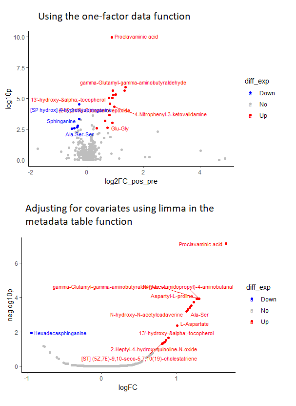
I am running an untargeted metabolomic analysis in samples of patients with Chagas disease. I originally ran the data through the one factor analysis function in metaboanalyst and got some pretty nice-looking plots (top panel of the attached figure)
However, I eventually decided to adjust my FC estimates and p values for covariates like age and sex. I ran the data through the metadata table function in metaboanalyst, specifically, I ran a linear model to get covariate-adjusted p values and fold changes. While at first sight the results look ok, when I decided to plot the FC vs p-values in R to plot volcano plots, I see this weird U-shaped pattern (bottom panel), suggesting that the p-values are behaving like they are a function of the FC. In fact, upon checking the data again, I noticed that the p-values of metabolites with similar FCs seem to be very similar, apparently confirming this observation
I’m not particularly familiar with metabolomics, but that doesn’t seem to be right. Please note that all of these analysis were run directly in metaboanalyst, I only used R to produce the plots, so I don’t really have the code for whatever metaboanalyst did.
Has anyone faced a similar situation, have any recommendations? Any comment will be greatly appreciated.
Thank you!