Hi,
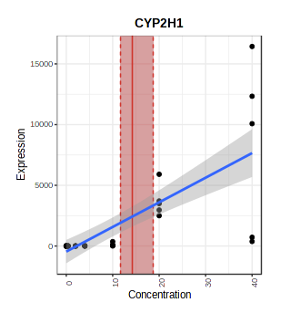
After you get to the BMD page, you are able to look at the different gene-level BMDs. In the figure, I know the red line represents the gene-level BMD (from the dose response curve - blue), but what is:
For the red, the middle vertical line is the BMD, the lower limit of the red is the BMLl, and upper limit is the BMDu.
The blue is the fitted curve, and the grey is the confidence region of the fit as determined by the ggplot2 R package. We don’t compute it earlier, it’s just generated by the visualization function.