Normalization: none. Data transformation: log. Data scaling: autoscaling.
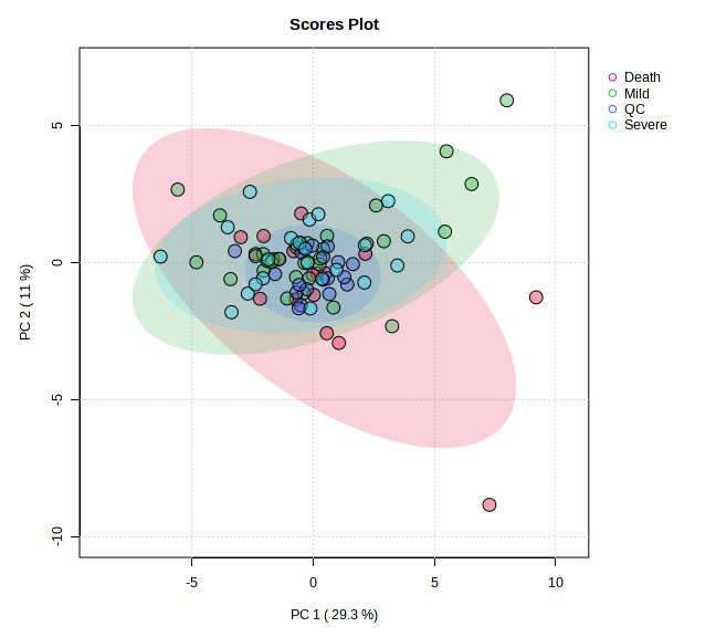
PCA analysis > 2D Scores Plot: Look that QCs are the blue circles and the Severe group are the light green circles.
Go to Data Editor > Edit Groups: remove the QC group.
Apply the same normalization, transformation and scaling as did above (step 4).
PCA analysis (in fact, no matters what analysis is selected in this step, should be PLS-DA also).
Go back to Data Editor > Edit Groups: include the QC group.
Same settings for normalization, transformation and scaling.
PCA analysis > 2D Scores Plot: Look at QC and Severe groups. QC and Severe groups were interchanged. The blue circles correspond to samples of the severe group.
Hi, I am not an expert user but I am having a similar problem.
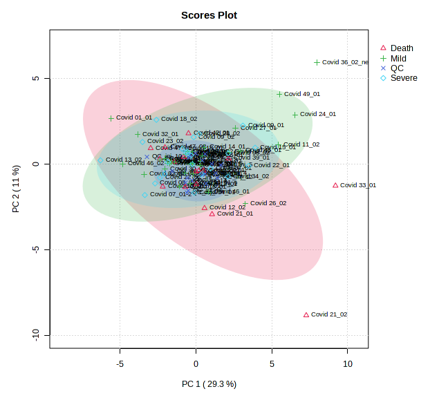
It happens with the greyscale PCA plots as well, where samples are mislabelled.
Any advice?
I do not know if the problem was corrected after the recent actualization of MetaboAnalyst (2023-06-23). I report that bug before that date.
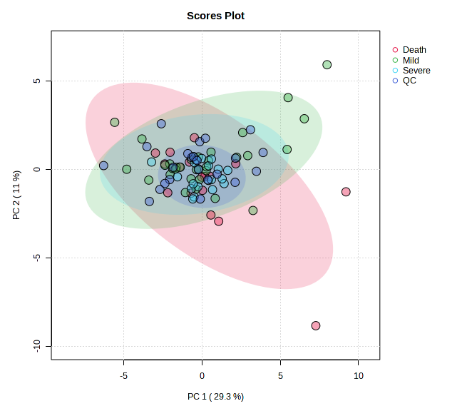
To avoid this problem, I realized that the order - in edit group tab - must be the same as the original set. That is, when the group is included again, it must be in the same order before it was excluded.
Original order:
Group A
Group B
QC group
Group C
Order after excluding a group:
Group A
Group B
Group C
Order after incluiding the group again: (The error is not observed)
Group A
Group B
QC group
Group C
Order after incluiding the group again: (The error is observed)
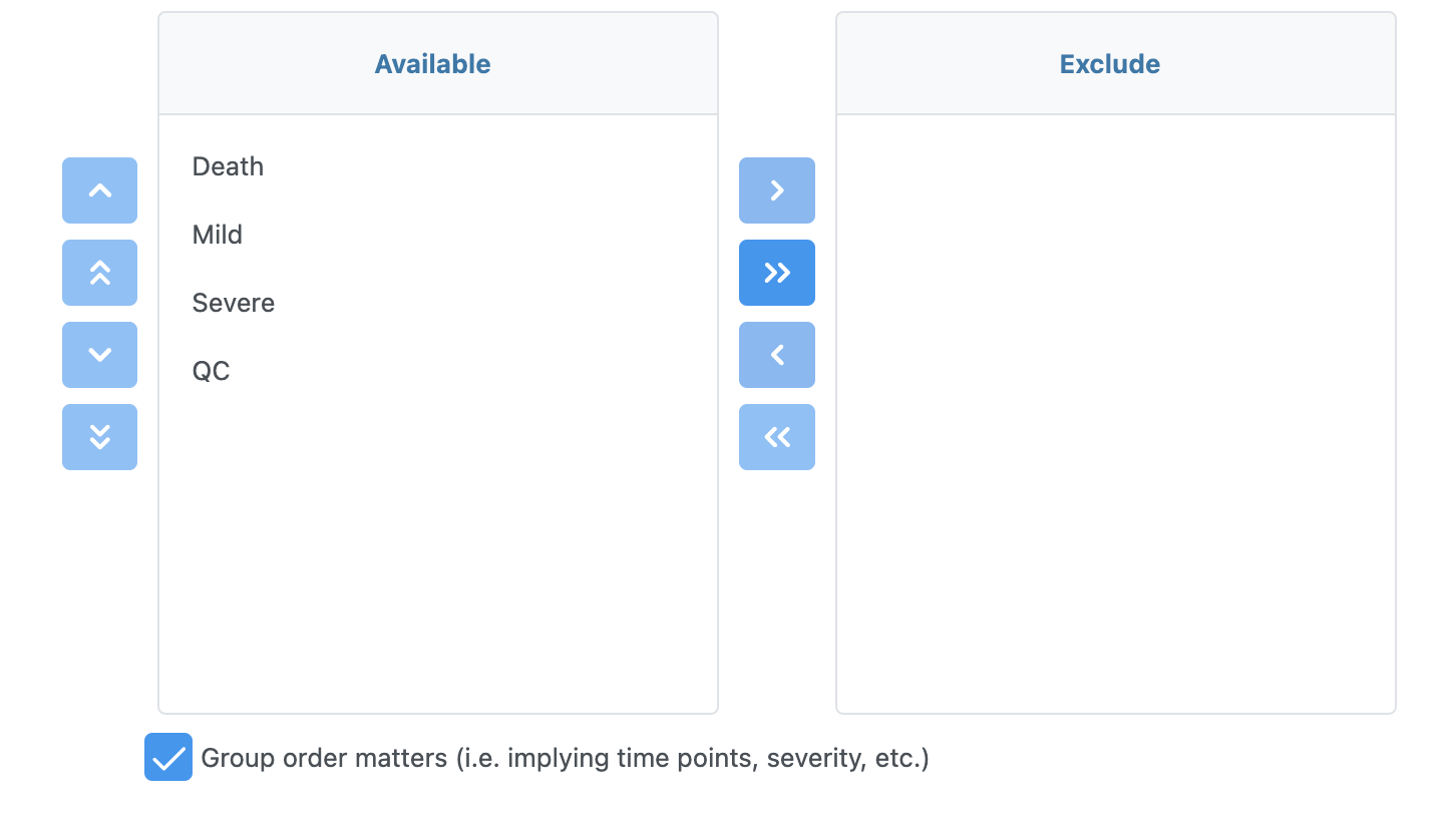
Indeed, this is the solution. MetaboAnalyst uses the Data Editor to allow users to update group orders (default is alphabetic order).
Now I make this as an explicit option (see below). If you would like to use the same color schema as before (i.e. alphabetic order), simple uncheck the checkbox shown at the bottom.