I am trying to get a better understanding of what is represented by the PC2 and PC1 axes in the PCA plot so I can try to describe what I’m visualizing. I’ve attached the example here. I have a study with 8 treatments plus one negative control and one positive control- 10 sample types total with three replicates for each treatment.
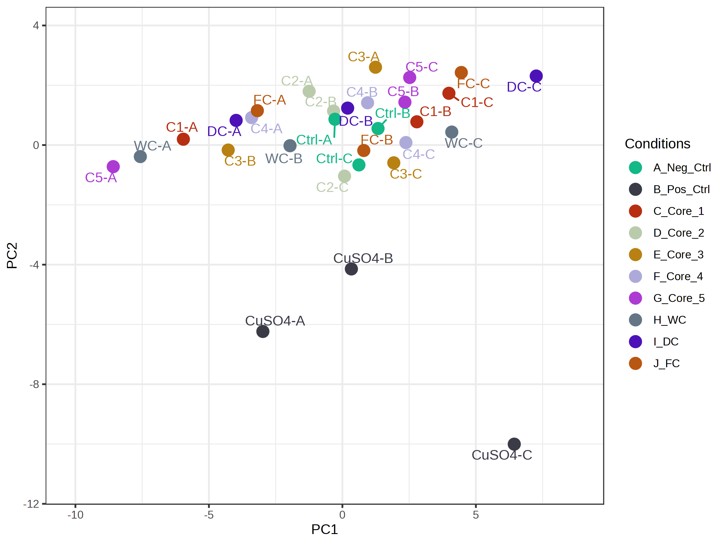
Here PCA is a step in data processing mainly for QC visualization, not for a full-blown data analysis as you described. The heatmap provides more information in the analysis page. You can also try to upload your data to ExpressAnalyst for PCA analysis