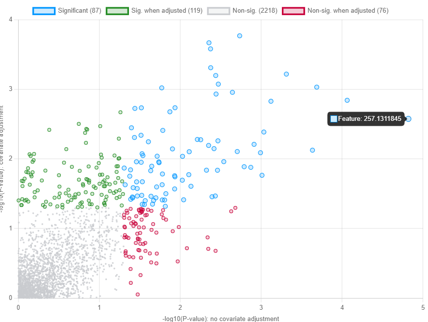
Hello I can’t seem to get hope the values plotted in the linear regression from the covariance table output of that same analysis. For example, in this attached screenshot,
Feature 257.1311 is at coordinates roughly (4.8,2.6). As per the table,
P-value is 0.0026634 with an adjusted p-value of 0.35044.
I can get 2.6 by gettting log10 of p-value but no idea where to calculate the 4.8 from.
Thank you very much for your time!
The y-axis shows the primary metadata p-value from the model that you specified:
metabolite ~ primary variable + covariates
The x-axis shows the primary metadata p-value from the simplest possible model:
metabolite ~ primary variable
The x-axis essentially gives you a ‘baseline’ to see the impact of adding covariates to the model. It is not the results from the model you specified, so we do not make them available for download to avoid confusion (ie. users reporting those statistics but saying they adjusted for covariates). If you really want the p-values and coefficients for the x-axis, you can simply specify the most simple model using the interface (ie. select a primary meta data but no covariates and no blocking factor). Then, the x and y-axis will be exactly the same and the results table will provide the details.
The file underlying this plot is now available in the Download page, under the name covariate_adj_vs_none.csv