The ROC curve is a fundamental tool for performance evaluation of diagnostic tests. It provides a complete and easily visualized report on sensitivity-specificity trade-off across different cut-off values . As shown in the Fig. below, in a ROC curve the true positive rate (Sensitivity) is plotted against the false positive rate (1-Specificity) for different cut-off points of a given parameter. Each point on the ROC curve represents a sensitivity/specificity pair corresponding to a particular decision threshold.
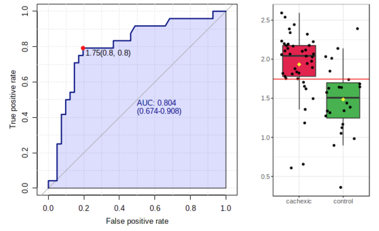
A test with perfect discrimination (no overlap in the two distributions) has a ROC curve that passes through the upper left corner (100% sensitivity, 100% specificity). Therefore the closer the ROC curve is to the upper left corner, the higher the overall accuracy of the test. The closer the ROC curve to the diagonal line, the poorer the diagnostic power of the test.
The area under the ROC curve (AUC) is a measure of how well a parameter can distinguish between two diagnostic groups (diseased/normal).