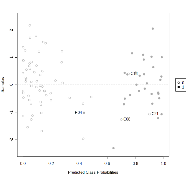
In multivariate ROC curve analysis, the prediction results from PLS-DA, SVM, RandomForests are presented in the form of probability [0, 1]. Since MetaboAnalyst uses balanced random subsampling, 0.5 will always be the cutoff point.
The prediction overview shows the predicted class probabilities (x-axis) of each sample (y-axis). The probability scores are the average from the 50 iterations, ranging from 0 ~ 1. For instance, less than 0.5 will belong to group A, more than 0.5 belong to group B. In theory, a sample could be located on the 0.5 line, which means the sample has never been selected for testing during the iterations.
Users can also use the Pred. Overview to identify potential outliers. For instance, if a sample is always predicted to have a high probability in the wrong group, this may indicate that the sample could be labeled incorrectly. Users can check “Label samples classified to the wrong groups” to identify these potential outliers. An example output is shown below