The power analysis in MetaboAnalyst is based on R package SSPA described here
The calculation is based on two assumptions:
- The test statistics follow a normal or near normal (Students’ t) distribution.
- The effect is indeed present in the data;
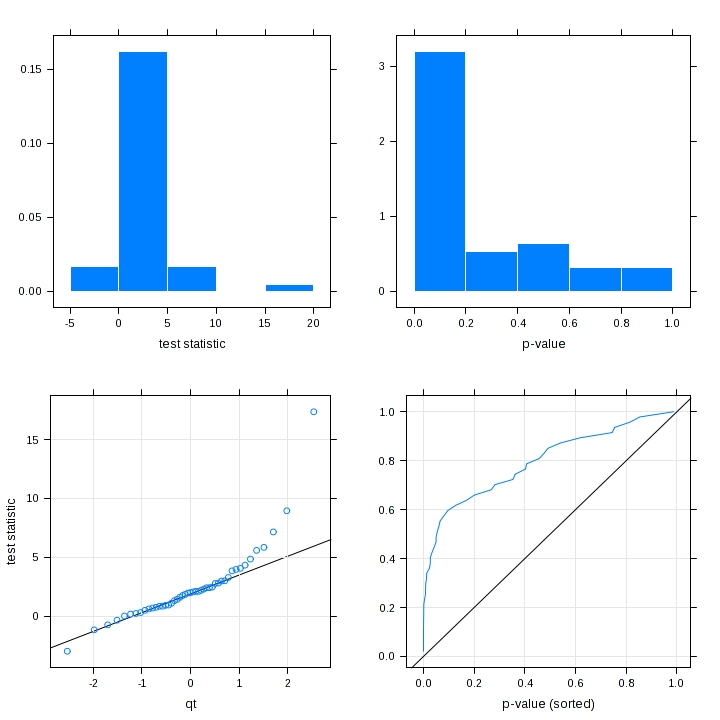
The diagnostic plot is to help assess whether these two assumptions are reasonably met. In particular, the panels on the left (normality assessment) shows the distribution of the test statistics (t-stat) as a histogram (top panel) and as QQ plot (bottom panel); the panels on the right shows the distribution of the raw p values as histogram (top panel) and the bottom panel shows the sorted p values against their ranks (effect assessment). We expect a large proportion of p values will be close to zero (indicating strong effect) - i.e. the histogram should be left-shifted and the bottom graph should shift to top left corner.