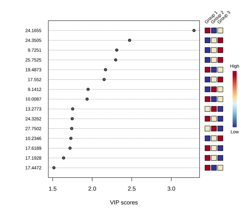
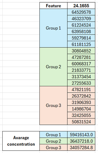
According to the relative concentrations showed in the graph, for the feature with the highest VIP value (the one named “24.1655”), Group 1 should show the highest concentration for this compound, Group 2 the lowest and Group 3 should be in between them. Nevertheless, I have noticed a different behavior in the data matrix. When I calculate the average concentration considering the six samples of each group, Group 1 shows the highest concentration, followed by Group 2 and then by Group 3 (see image below).
I think the values you’ve shown are the original values - the plot is based on normalized values. There are times they don’t agree with each other (more common for small sample sizes). Briefly, normalization can change the ranks.
To find out if this is the case, 1) click the table icon on the top right of the figure to view details; On the details view page, 2) click this feature to view its boxplot / violin plot at both original and normalized scale.
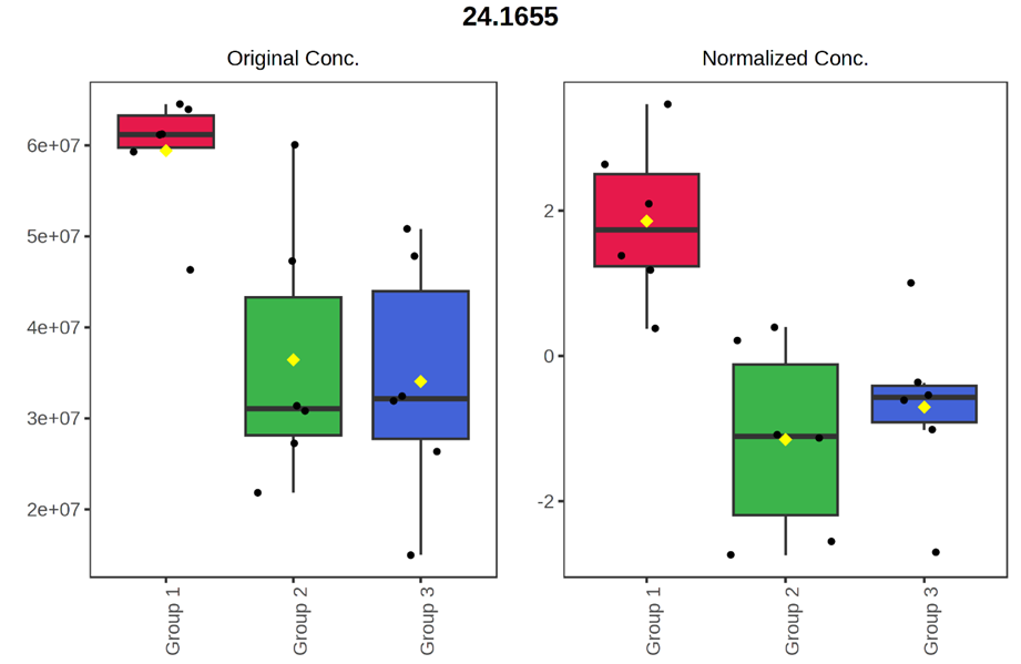
The feature box plot showed that data normalization caused the inconsistency. The sample size was indeed small (n=6 for each group). Thank you very much for the accurate answer and for the advice.