Dear metabolomics community,
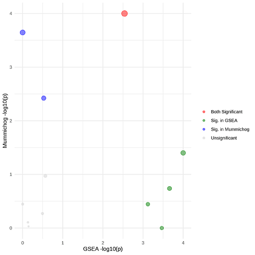
I used the Functional analysis [LC-MS] module based on Mummichog 2.0 + GSEA on the MetaboAnalyst 6.0 platform, but I think there is an error in the script to color the dots on the resulting pathway activity profile plot.
The legend mentions a red color for pathways whereby both GSEA and Mummichog are significantly altered, blue when it is only significant in Mummichog and green when it is only significant in GSEA. When I look at the output tables I have 3 pathways that are significantly altered in both Mummichog and GSEA. However in the exported plot, only one of these is colored red.
I tried to check if it might be a misinterpretation of the significant cut-off set for each P-value, but I couldn’t match the coloring with a meaningull cut-off in my data.
I would like to use this image for publication, and highly appreciate any help in figuring out why the plot and table doesn’t match.
Hereby I provide the required data and information to reproduce the issue:
- Functional [LC-MS] analysis based on an intensity table in positive mode, with RT in minutes, samples in columns
- Mummichog + GSEA selected
- No additional filtering steps were added (the data was filtered previously)
- No normalization (data is iQC normalized), log transformed and Pareto scaled
- Pathway library used = Canis lupus familiaris
- P-value cutoff default (0.25, top 10% peaks)
- Only use pathways/metabolite sets containing at least 3 entries.
This results in the following table and corresponding scatter plot. However, I don’t think the colors in the scatterplot match the P-values obtained and displayed in the table. Could this be a coloring problem or am I missing something in the interpretation?
Data file:
Faeces_untargeted_pos_OK.txt (2.3 MB)
Outcome table and scatterplot:
2024_Faeces_untarget_pos_mummicho_pathway_enrichment_integ.csv (756 Bytes)
Thank you!
