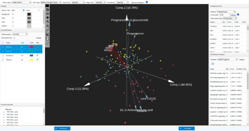
A biplot overlays a score plot and a loadings plot in a single graph. In the biplot view, points are the projected observations (samples); vectors (arrows) are the projected variables. If the data are well-approximated by the first three components, a biplot enables you to visualize high-dimensional data by using a 3D space. You can visualize both the patterns (sample distributions) and the features that driving such patterns.
- Points that are close to each other in the biplot represent observations with similar values.
- The cosine of the angle between pairs of vectors indicates correlation between the corresponding variables. Highly correlated variables point in similar directions; uncorrelated variables are nearly perpendicular to each other.
- The cosine of the angle between a vector and a principal component axis indicates the contribution of the corresponding variable to the principal component: the more parallel to an axis is a vector, the more it contributes only to that PC.
To perform biplot visualization:
-
Select “Biplot (merged view)” under View options in the top menu bar.
-
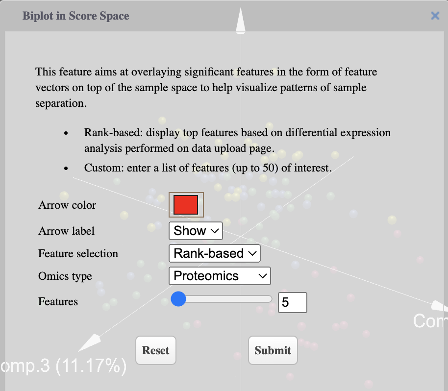
Select omics type, features to be displayed and color of arrows using the dialog
-
Biplot visualization: each arrow represent a feature, top 5 features based on differential expression analysis from each dataset are displayed here.