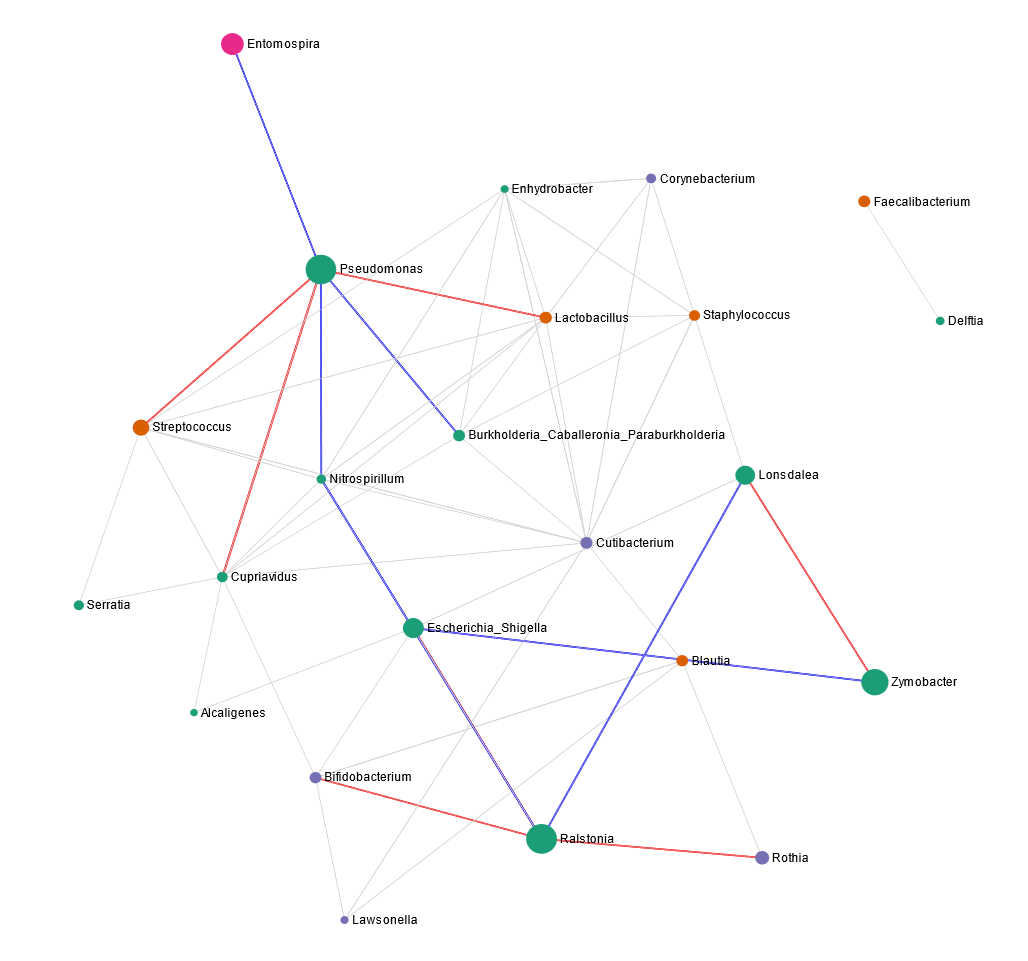
The default font size of printed version (svg file) is too small, and the correlation values are not printed.
I could easily add correlation values on the figure in ppt, but it’s a bit tricky to edit taxon names as it messes with the connecting lines and also it’s gets a bit of too much work if there are too many taxa.
Could you please give option to change font size for taxon names? Similarly, it would be really great to have such option for other analyses such as stacked bar/area plot for large sample size figure.
Thanks!