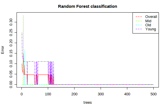
The graphical output from Random Forests shows the changes of error rates with regard to the number of trees as the forests built. It can indicate when the performance will stabilize after certain number of trees. Users can also see which group tend to have higher error rates, which group is relatively easy to predict. For instance, the example below shows that using ~120 trees, the algorithm can achieve perfect prediction for each group.