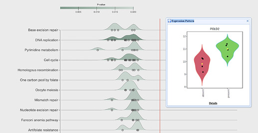
The ridgeline chart summarizes results from enrichment analysis, with each row showing the distribution (density plot) of log2FC values of the underlying genes (DEGs for ORA, or all genes for GSEA) from one pathway. Users can directly click on any genes of interest to find more details (see the Fig. below).
Visualizing too many pathways can overwhelm the graphic, so there are tools in the Diagram Settings pane (top left) to control the number of pathways to visualize (“Top Pathways” dropdown). The remaining inputs in the Diagram Settings pane control the appearance of the plot. The “P. val threshold” controls whether the pathways are highlighted - if they do not make the specified cut-off, the density plot will be shaded grey instead of the selected color.
The functions to conduct enrichment analysis (Enrichment Analysis pane on bottom left) use the same algorithms as other visual analytics tools in ExpressAnalyst. See the posts on ORA and GSEA for more details on how these work.
