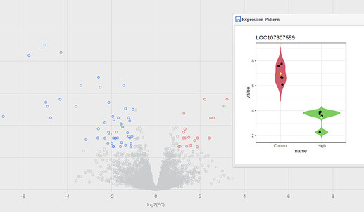
is it available in NetworkAnalyst to draw simple scatter plot with just X and Y arrows to show downstream and upstream expression of genes(treated) in comparison with control?
Hi Atiyeh,
I’m not sure I understand what you are referring to. We have moved our general gene expression analysis tools to ExpressAnalyst. On the “Sig. Genes” page, there is a table with all differential expression results. There are image icons beside each gene - you can click them to generate violin plots with individual expression values for each sample. The y-axis shows expression values, and the x-axis shows treatment groups. Is this what you are looking for?
Thanks,
Jessica
