The correlation network results are nice. However, I cannot download complete figures with gene/taxon labels.
When the network is small, the labels disappear. To see labels, I have to enlarge the figures. They became too large that only parts of the figures were visible, and that’s all I saw in the downloaded PNG files.
Is there any way to customize the labels so I can produce the whole figures with gene/taxon labels? Or could I download the entire figure rather than only the visible part? How?
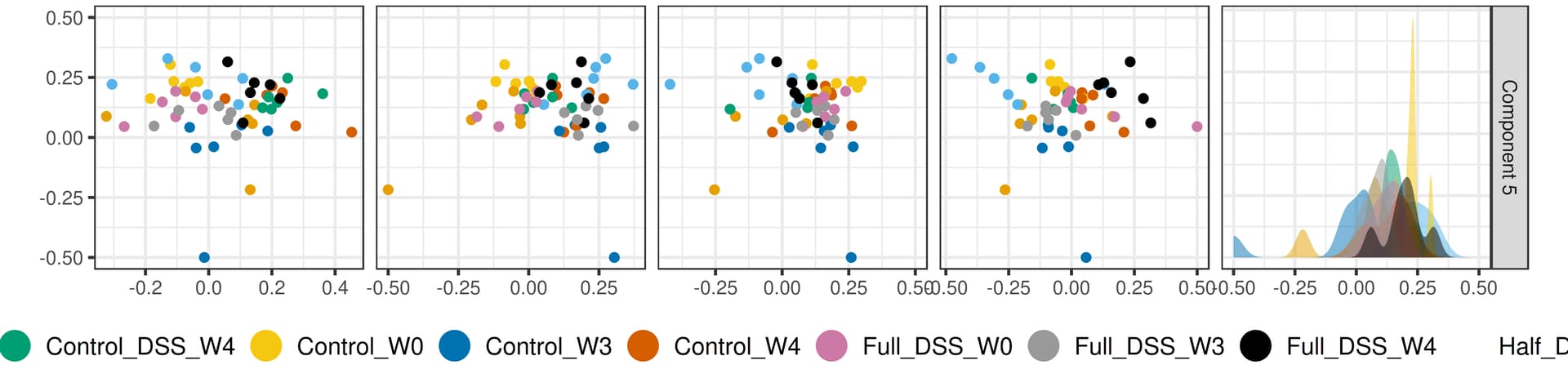
I have another similar question for the graphical summary of the Dimensionality Reduction Overview.
My treatment conditions labels (12 in total) were partially cut off from the factory scores plot. How do I produce a graph that includes the complete condition labels?
For the network labels, I have added an option that display all labels. It is accessed through the top menu bar Style – > Label. Under “Display” tab, select “All” option.
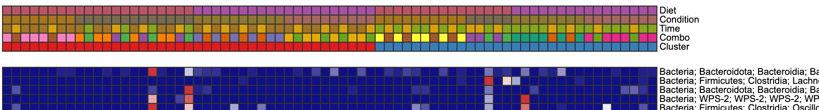
The overlapping area at the border is fixed. However, the taxa names on the right side were cut off. Similar problems happened for dimred_factors plots. Complicated metadata conditions were cut off from the right side.
I pasted examples of both plots for your reference.
Heatmap plot: It would be nice if I could edit the taxa names and display only the relevant information. The edit function in the previous step did not work for me. I clicked the next column and changed the name. Then I had to go back the previous page to proceed, which reversed the edits to their old names.