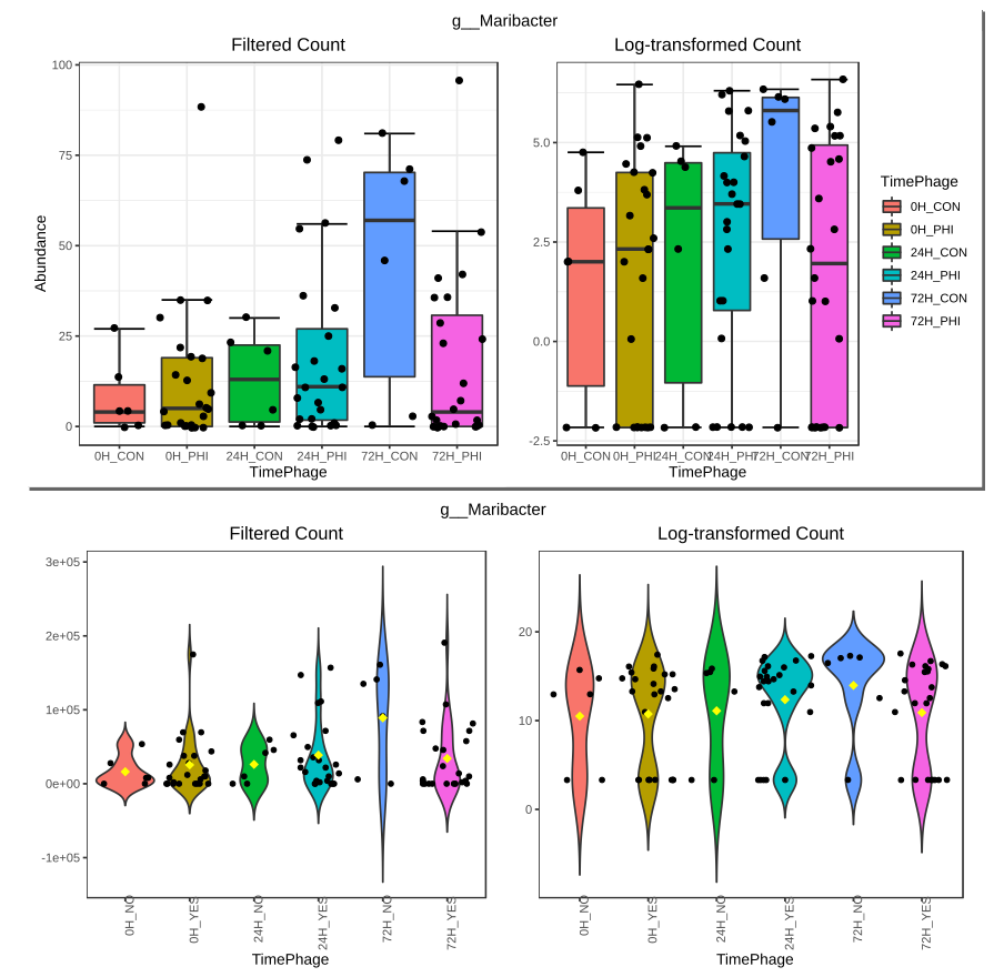
In the different analyses modules when there is an option for “feature details view” that shows the count for the taxon at the selected taxonomic level, the abundance was shown with a boxplot, and it was pretty good.
With a recent change, the boxplot was changed to a violinplot that can have some advantages, but unfortunately looks worse.
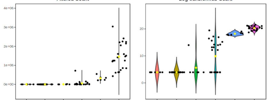
Below a comparison of the same data (with different filter settings though) with the old boxplot representation on top, and the new violinplot representation below:
What has become worse:
-
data representation
– y-axis: the count axis goes into negative ranges which makes no sense, so the actual range that you are interested in spread because of the violinplot over much lower and higher ranges.
– median: barely visible
– low counts: a violin plot isn’t very informative and in some cases is reduced to a single line, e.g.
-
legend: missing
-
y-axis label: missing
What’s better:
- x-axis tick labels: vertical orientation prevents overlap
I would strongly prefer the boxplot, but could you please fix the y-axis if possible to not go into negative ranges?
Hope this feedback is useful, I find your platform very useful. Thank you.