An Upset plot is an alternative to the Venn Diagram to show the overlap of a large number (>3) of sets by arranging them as bar charts of their frequencies. An example is shown below:
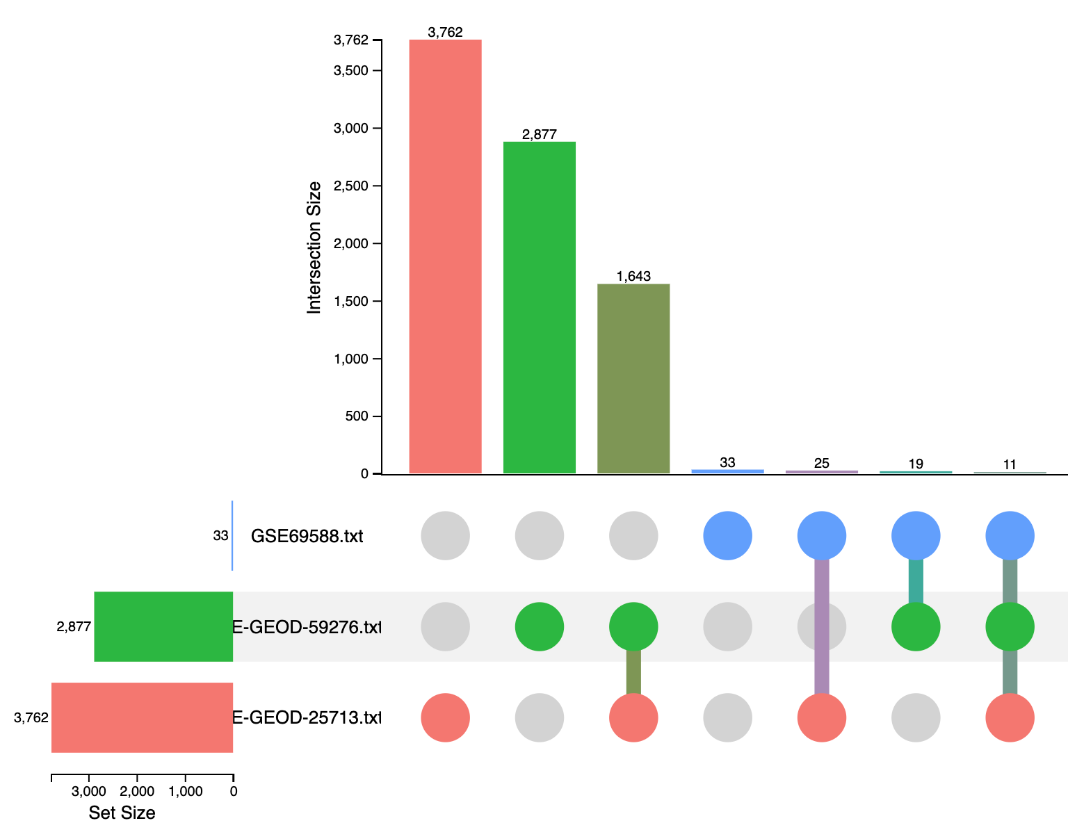
The heights of the vertical bars at the top half of the image correspond to intersection size—the number of significant genes that are shared among the corresponding datasets (as highlighted with different colors at the bottom half of the image). For example,
- the 1st vertical red bar shows that dataset ‘E-GEOD-25713’ contains 3762 DE genes;
- the 3rd vertical bar shows that E-GEOD-59276 and E-GEOD-25713 share 1643 DE genes;
- the 4th vertical blue bar indicates that GSE69588 only contain 33 DE genes.
- the last bar shows that 11 DE genes are shared across all three datasets.
The Upset plot in ExpressAnalyst is interactive, users can click on a bar to show the underlying DE genes displayed on the right panel